
Woman in Oakland, leaning on props
Click here to view it larger.
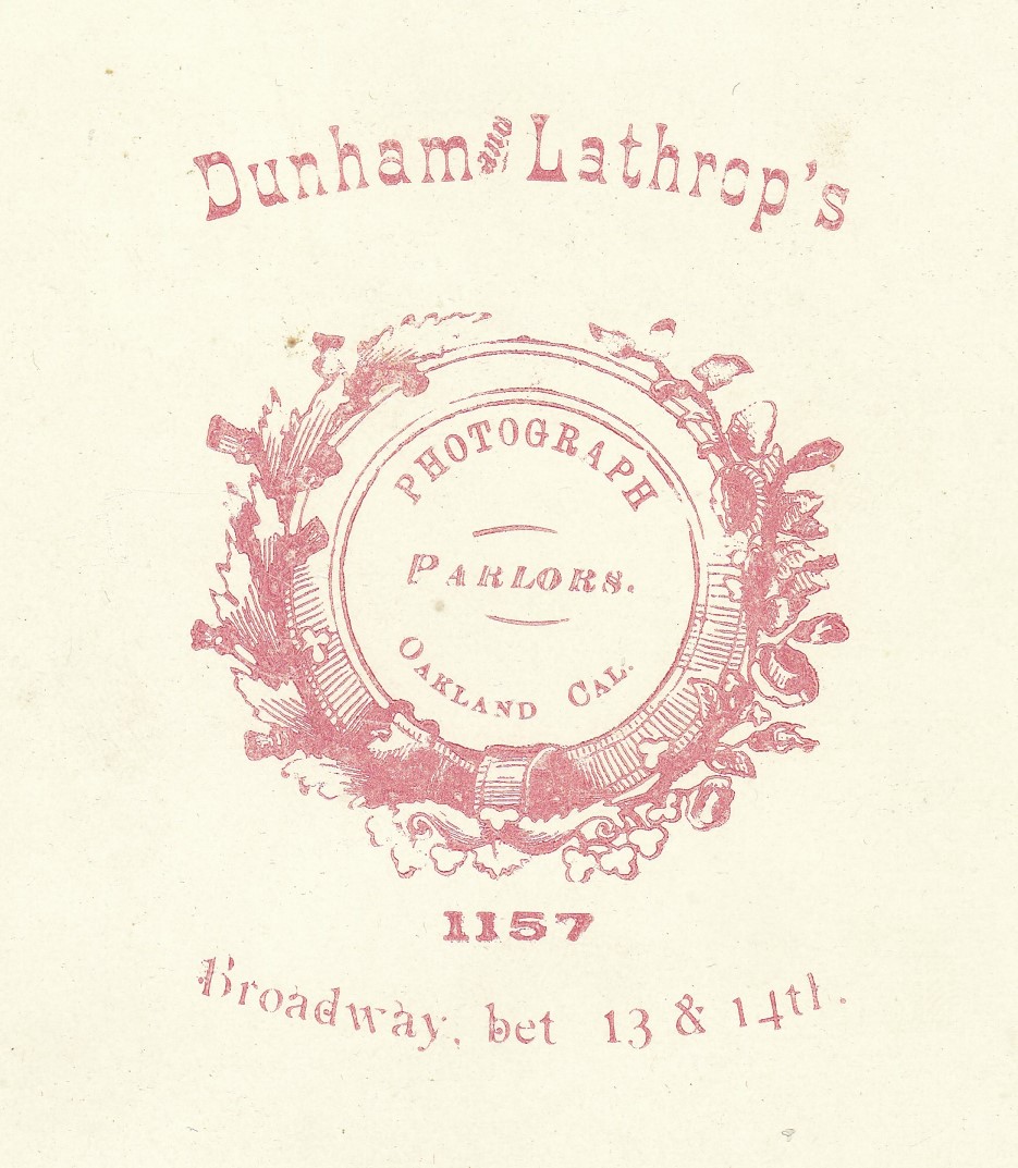
This one is fun for what I assume is its inadvertent quirkiness. I know Victorian era decor could lean towards the cluttered. And I know it can be an artistic choice to photograph things off-center. But this looks like the woman needed a break from getting her picture taken and leaned on a mound of studio props off to one side, at which point the photographer shifted the camera far enough to get her body centered and took the picture, somewhat to her consternation. Was she trying to have such a fierce expression on her face for the photo, or does she look like that normally? Is the back of her dress not quite hanging correctly, exposing some underlining near the bottom? Is there some significance to her posing with a statue of Mozart? The chair is pretty, but the arms don’t look especially supportive. I hope she was content with her portrait. By the way, this is a cabinet card, and the photography studio is Dunham & Lathrop in Oakland, California. If you’re interested, click below to enlarge the logo from the back.


She may have wanted to show off her bustle (who wouldn’t?), but the empty space behind her makes the photo seem out of balance. And why is Mozart forced to hide behind a drape? I like her face, though. Lots of personality!
Yes, agreed to all this. I have a number of photos where empty space looks like an artful choice, but it doesn’t quite work for me here. The drape has a pretty border, but its position makes it look more like a drop cloth covering a pile of stuff than a curtain. We’re not even able to see what she’s leaning on. But yes indeed, she looks like a character!
Sometimes it feels like mass-produced logo designs are a modern digital invention, but it seems obvious here that the architectural circle was purchased and customized with type, rather than designed specifically for this studio. Though it’s likely no customers would know, since the studio wouldn’t be on the worldwide web for everyone to compare their branding with other studios’. Until now!
Sometimes, the graphic design on the back will include not only the name of the photographer, but the name (in tinier print) of the publisher who designed and printed the graphic.