
People in Cooperstown and Richfield Springs, New York
By: usermattw
Tags: antiques, CDV, Cooperstown, photography, Richfield Springs, vintage photography
Click here to view them larger.
While I realize that most of the photos in my collection are out of context, I am loathe to be the one to separate them. So when the proprietor of an antique store pulled a vintage photo album out from under the counter, with photos supposedly from the same family (or at least all original to the album), I realized I had to make a decision. I knew I couldn’t afford the whole album. But I really hate splitting up sets. I’ve been known to buy photos I don’t really want, just to avoid separating photos that obviously belong together. And I really liked many of the images I was being shown. What finally assuaged my guilt was the fact that there were numerous empty pages in the album, because he had already sold a good number of them. So I picked these four little cartes de visite. I don’t know who they are or what relation they had to each other beyond having been in the same family album, but in the spirit of maintaining that connection, I’m posting them all together.
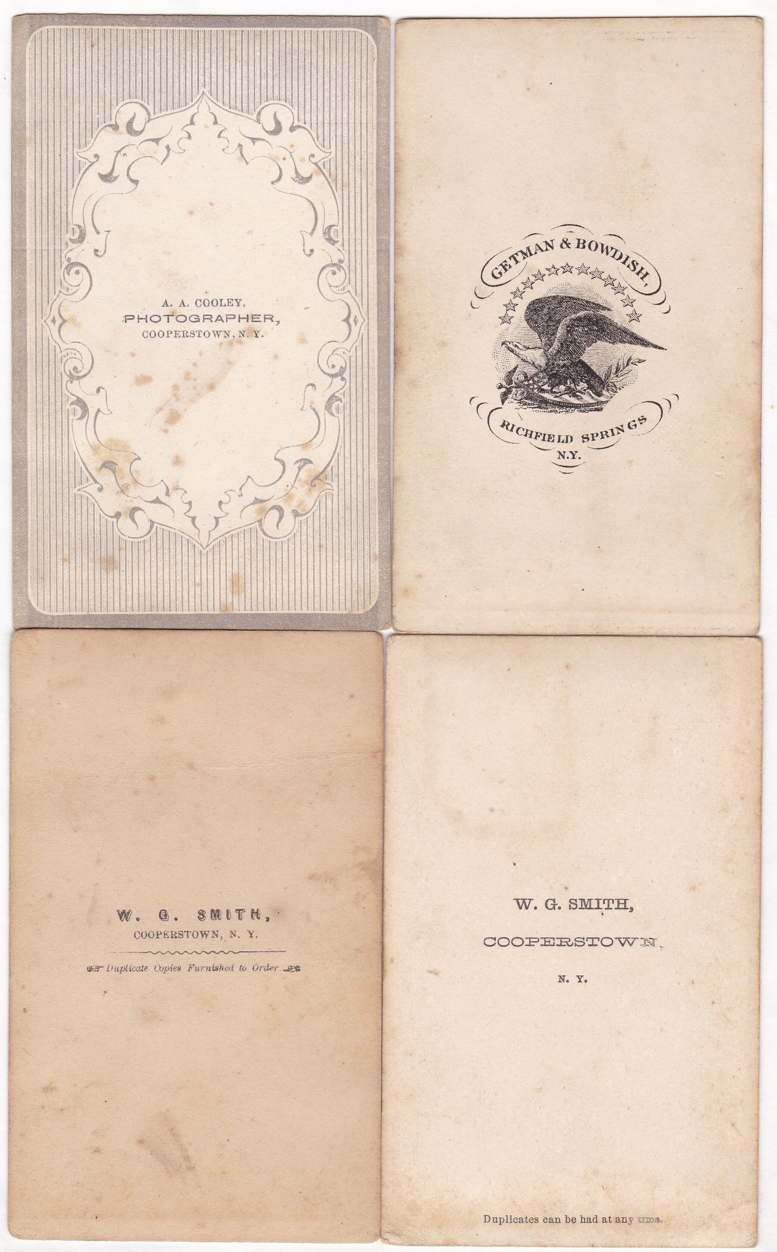
You can click below to see the backs. The upper left is by A. A. Cooley of Cooperstown, NY. I found a small item in a local newspaper from 1888 that said “Mr. A. A. Cooley, by a new process, is now enabled to take pictures after sundown. He has made several excellent negatives in the evening lately.” The upper right is by Getman & Bowdish of Richfield Springs, NY. And the bottom two are by W. G. Smith of Cooperstown, who I think is Washington G. Smith.


I, too, hate to break up sets!
Glad I’m not the only one.
BTW, as a graphic designer, I can’t stop staring at the side-by-side typography comparison in the bottom row of the back-side images. The one on the right is miles more legible, but that “we can’t flip it so we turned it upside down” pointing hand on the left is so endearing.
Haha, yes, agreed on both points. I always wonder what prompts a studio to change its graphic design. In this case, I’m sure legibility was the issue. Sometimes a change it made in the design when a change is made in the studio (like a new location). Other times it seems like they just wanted to freshen up their image, maybe changing with the changing tastes of the times, though the results are sometimes mixed. I also think (though I’m not sure) that many of the backs are printed by an outside print shop, and changing the print shop might require a change in the design, depending on the limitations of the shop.